iTunes for Data

Success in our GitHub for Data tool led to an obvious question: Could this same technology be packaged into a B2B tool, a.k.a., an iTunes for Data? Consequently, in late 2015, the team began working on AIR.
From our consulting practice, we knew there was an opportunity to sell to corporations with divisional organizational structures. In such organizations, division heads had the freedom to adopt varied technology stacks and could independently authorize some budget. In hyper-competitive corporate environments, divisional heads loved to showcase in review meetings how well they stayed on top of data.
Technically, most of them used the same datasets, albeit spread across Google Sheets, a few databases, and some new API-driven tools. Our expertise in handling a variety of data proved invaluable. Fortunately, the cumulative size of this data usually did not exceed 5-100 MB.
Most tools in the market are “data-do” apps that focus on data storage, ETL, analysis, visualization, reporting, etc., but did not actually aid the business user in their daily life. Hence, we aimed to lay the groundwork for building “data apps” that would focus on automatically suggesting data cleaning rules, surfacing important and related data, aiding in reducing the time for exploratory data analysis, suggesting and self-calculating famous metrics/KPIs, showcasing benchmarks, etc. “Data-do” apps are a cost-center, whereas “data apps” help business users do their job better.
While our GitHub for Data was a comprehensive web app, for AIR, we opted to build it as a desktop tool that would sync only the client’s metadata to our servers. This approach meant that the company’s 5-100 MB of data remained on each user’s individual laptop, with all computation also occurring there. The biggest challenge was enhancing the user experience — information architecture, flow, education, and UI. We needed to make operating data approachable for non-techies.
While the team was developing the tool, I flew to San Francisco to spend a month there. At that time, companies like DOMO, Looker, and Periscopic Data were highly popular, raising significant funding. My most notable encounter was with Sameer Al-Sakran from Expa Labs, who had launched a relatively unknown tool called Metabase.
Fast forward a few months, as a bootstrapped entrepreneur, I realized it didn’t make sense for me to participate in the fiercely competitive business intelligence industry. Fortunately, I had the opportunity to sell this intellectual property to a customer. With this transaction, AIR’s journey concluded.
To this day, we incorporate some of the core ideas from this era into Humane Club, and I continue to use Metabase wherever possible. At Times Internet, all my personalization reporting is done via Metabase.
Problem
Companies with data-driven managers are more efficient. In fact, a Nucleus Research report states: “Analytics Pays Back $13.01 for Every Dollar Spent.” However, there are significant challenges:
- Data is locked in silos. It may be spread across Excel files, databases, and SaaS software.
- Sometimes company culture does not promote transparency. Data is locked behind function and hierarchy.
- There is no bird’s eye view of what all data pieces exist.
- There is no bird’s eye view of how these pieces can fit together/connect.
- Once a dataset is discovered, there is no appropriate documentation on how to interpret the data.
- There is no easy way to mix datasets.
- MIS teams and data analysts in the company are often disconnected from day-to-day business execution.
- Even the most data-driven managers among us today are at most skilled in MS Excel.
Inspiration
This problem is already solved by iTunes, albeit for music collections. One can organize all their music by artists, albums, year, genre. The software also allows you to mix songs you want to explore together into playlists. Algorithms and data science can also recommend similar music that you should explore. Why isn’t there something like this but for all the data in my company?
Why iTunes? Every iTunes release felt like a chapter in the same book.
- The first version of iTunes allowed you to copy your music and then organize it yourself.
- The next version of iTunes came with an algorithm that helped you clean your data behind music lists.
- The next version of iTunes came with a marketplace of clean music.
- Also, iTunes comes with GarageBand or iMovie (same family of products), which is about mixing and cleaning music. (Pro Tools).
Solution
AIR helps you break down silos, empower teams, and drive a data culture. It helps you answer questions like:
- What data exists that is relevant to my business problem?
- How can I help my team use the right data, faster?
- How do I get a bird’s eye view of my organization’s data?
- AIR allows you to register all your data in one place.
What’s unique
- AIR embraces variety by giving you a thin layer of software on top of your data. The data remains with you and never leaves your local device.
- AIR helps you understand data, mix data, and drive better business decisions.
- AIR is not about storing data, it’s about using data.
User Experience Design
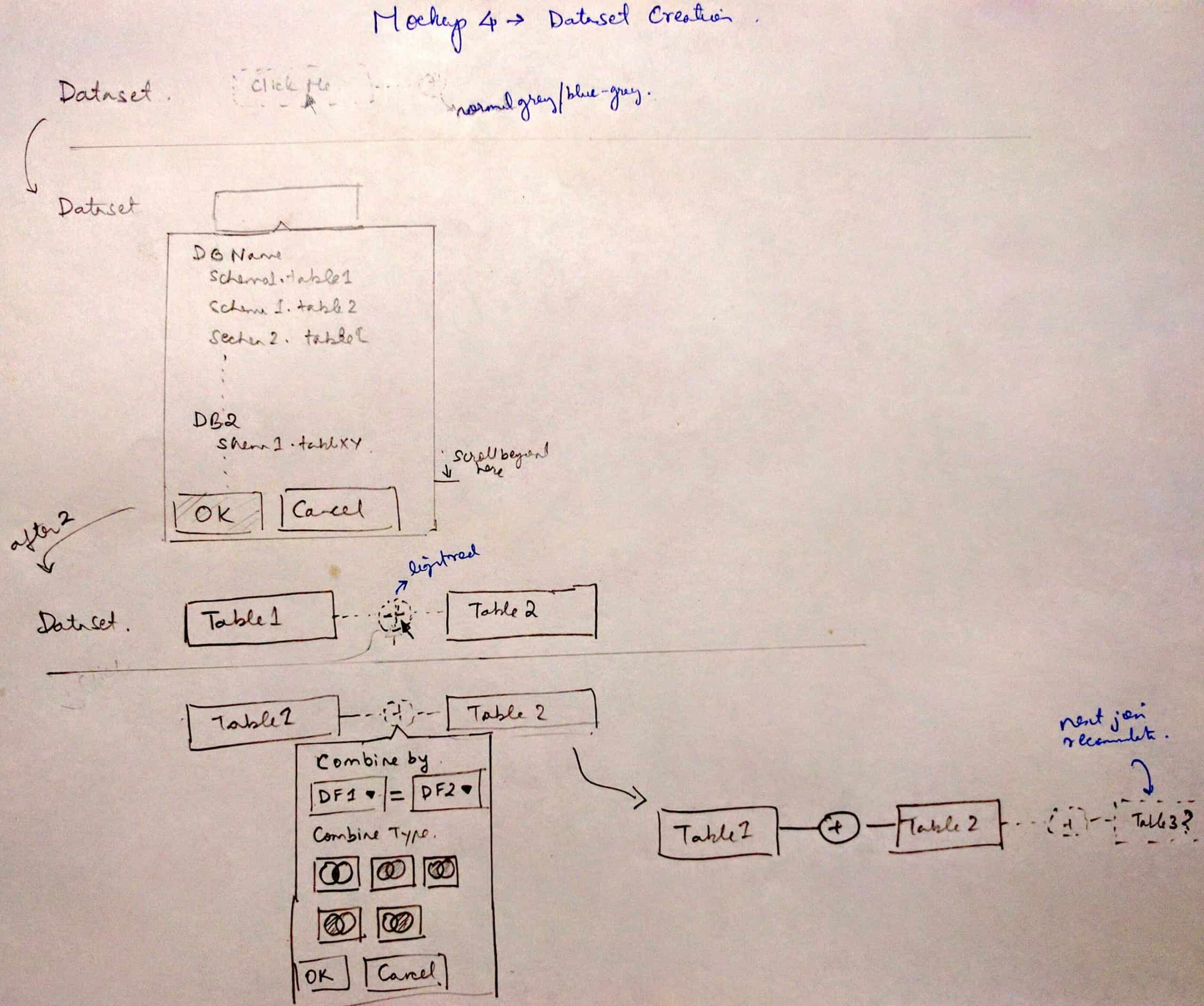
Cracking the information architecture and flow of the app was extremely critical. We iterated on it multiple times. Eventually, we came down to five clear job to be done:
- Store: This module involves Data Management, Discovery, and Mixing.
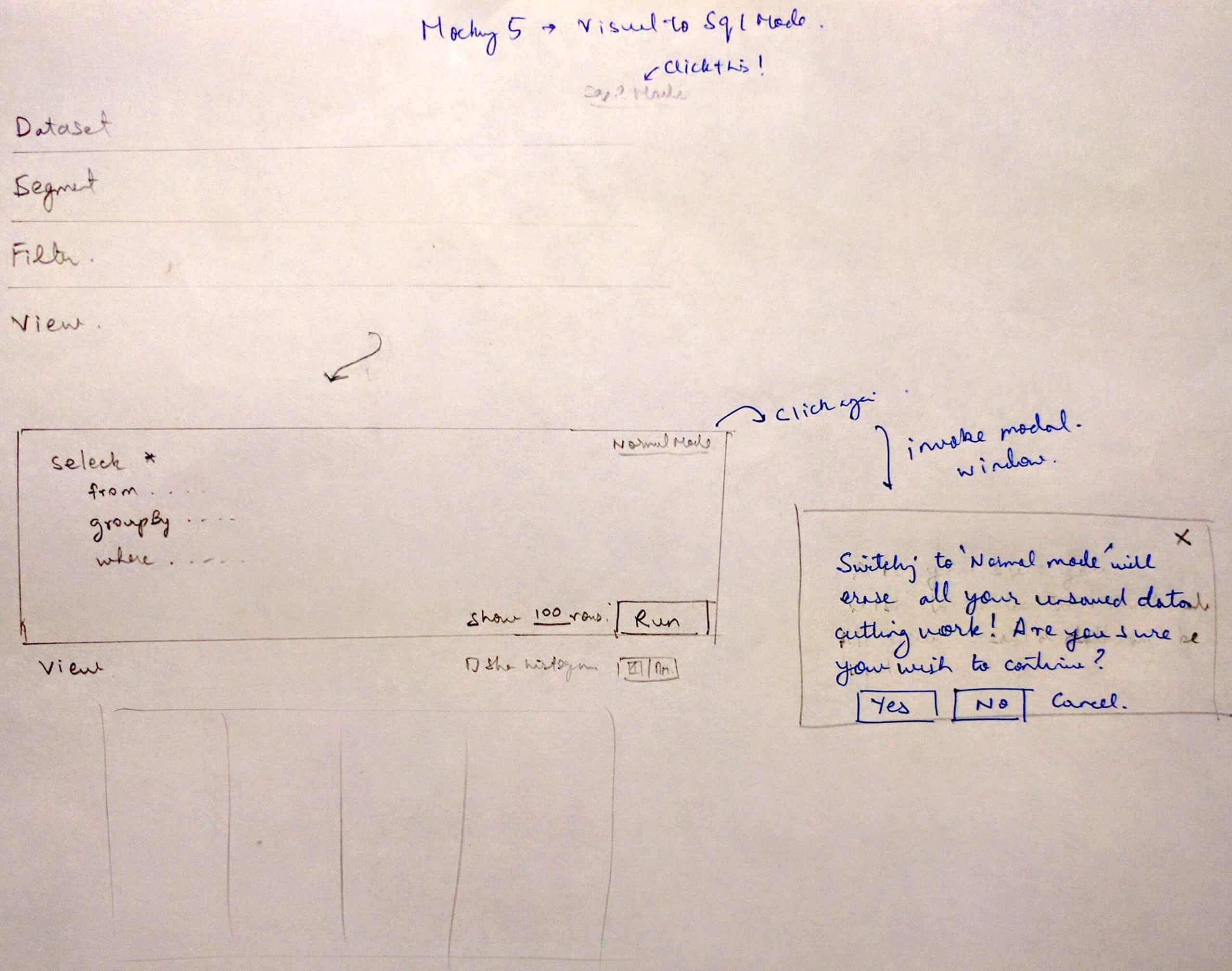
- Probe: A Tableau-like data exploration experience. We debated whether to name this module Probe or See. Eventually, we chose Probe because probing requires active analytical thinking, whereas seeing can be passive.
- Present: This is a data storytelling layer.
- Compute: Offers Drag-and-drop ETL for data transformation.
- Act: Serves as a decision journal.
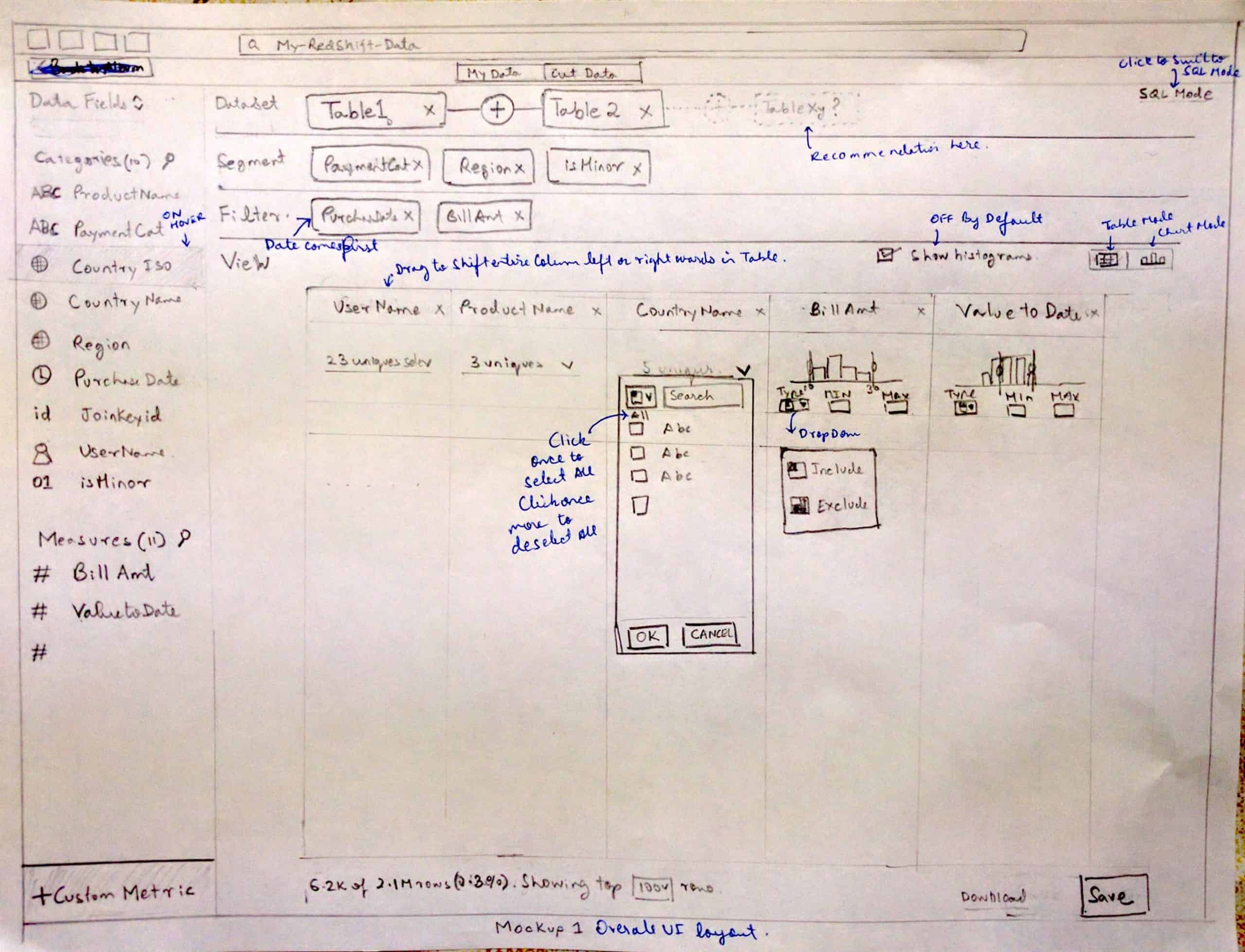
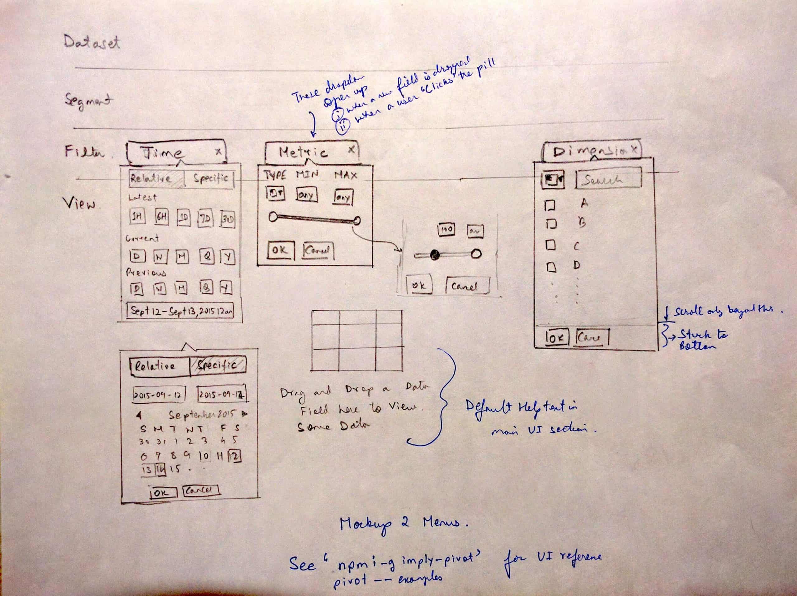
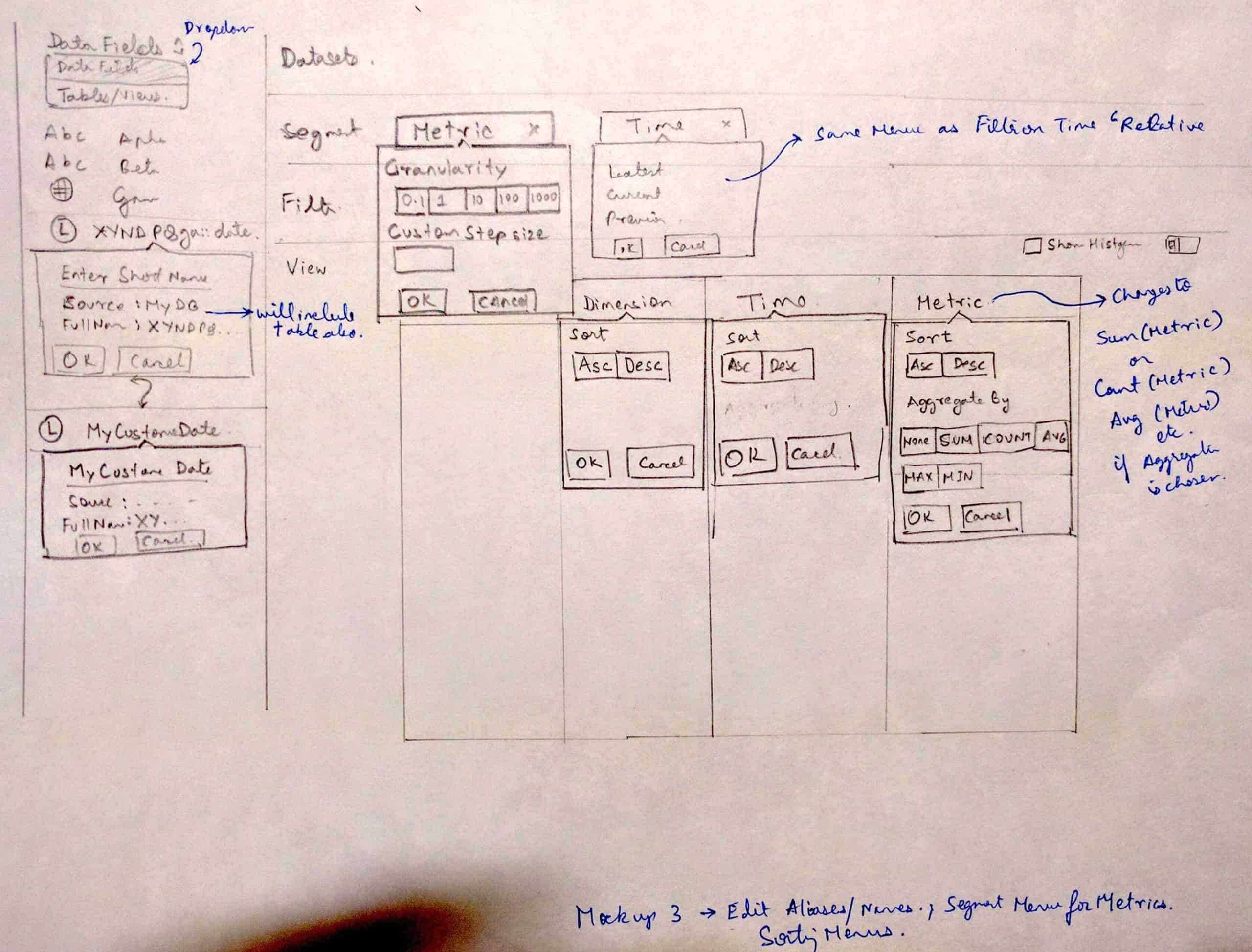
Demo
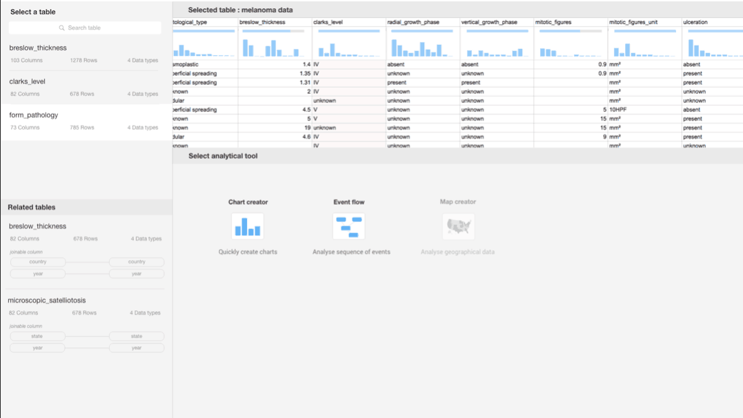
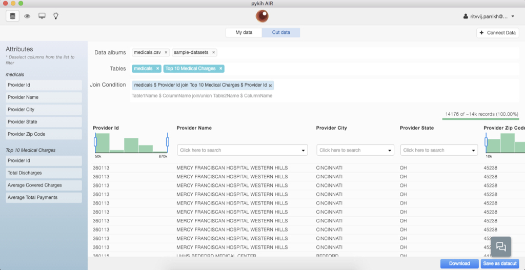
Store
You can view all your company’s data here. Preview the table and see the first 5-10 rows. The system automatically assesses the importance of each table and column based on usage and sets an importance bar for each data point accordingly.
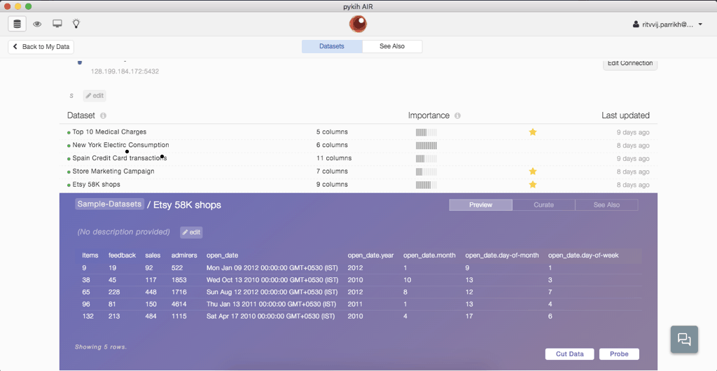
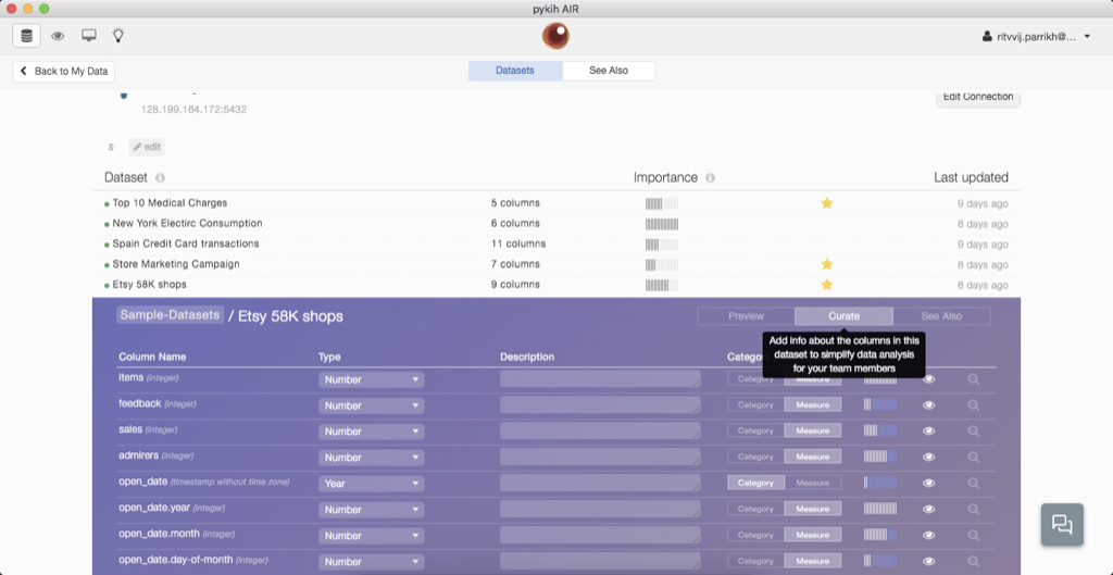
Click on the ‘curate’ tab to explore the data dictionary, which includes the columns, the data type of each column, and the purpose of each column. Click on the ‘see also’ tab to discover other tables that can be joined with this one.
For many of the algorithms in Store, we came to rely on this paper from Google.
Data Cuts offers a simple interface to help business users select, combine, and slice data across multiple datasets. This process narrows down the data before visual exploration. Data Cuts can mix data from two Excel sheets.
This feature allows you to reduce large datasets to smaller, more relevant data, thereby increasing the probability of finding relevant insights instead of random correlations.
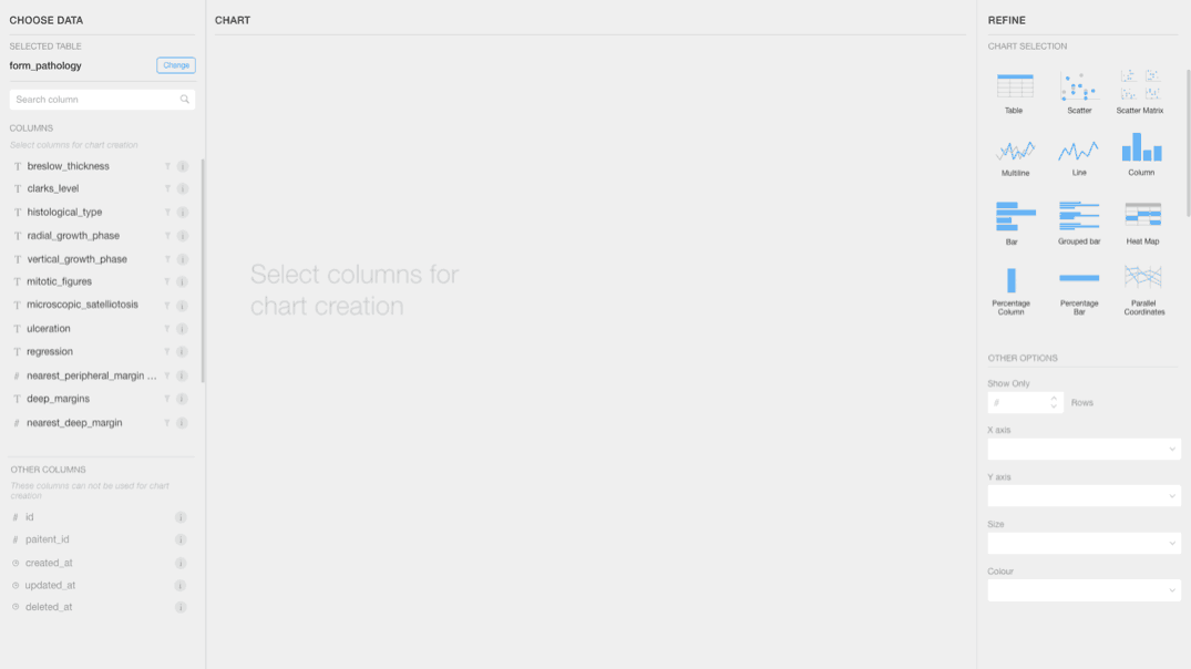
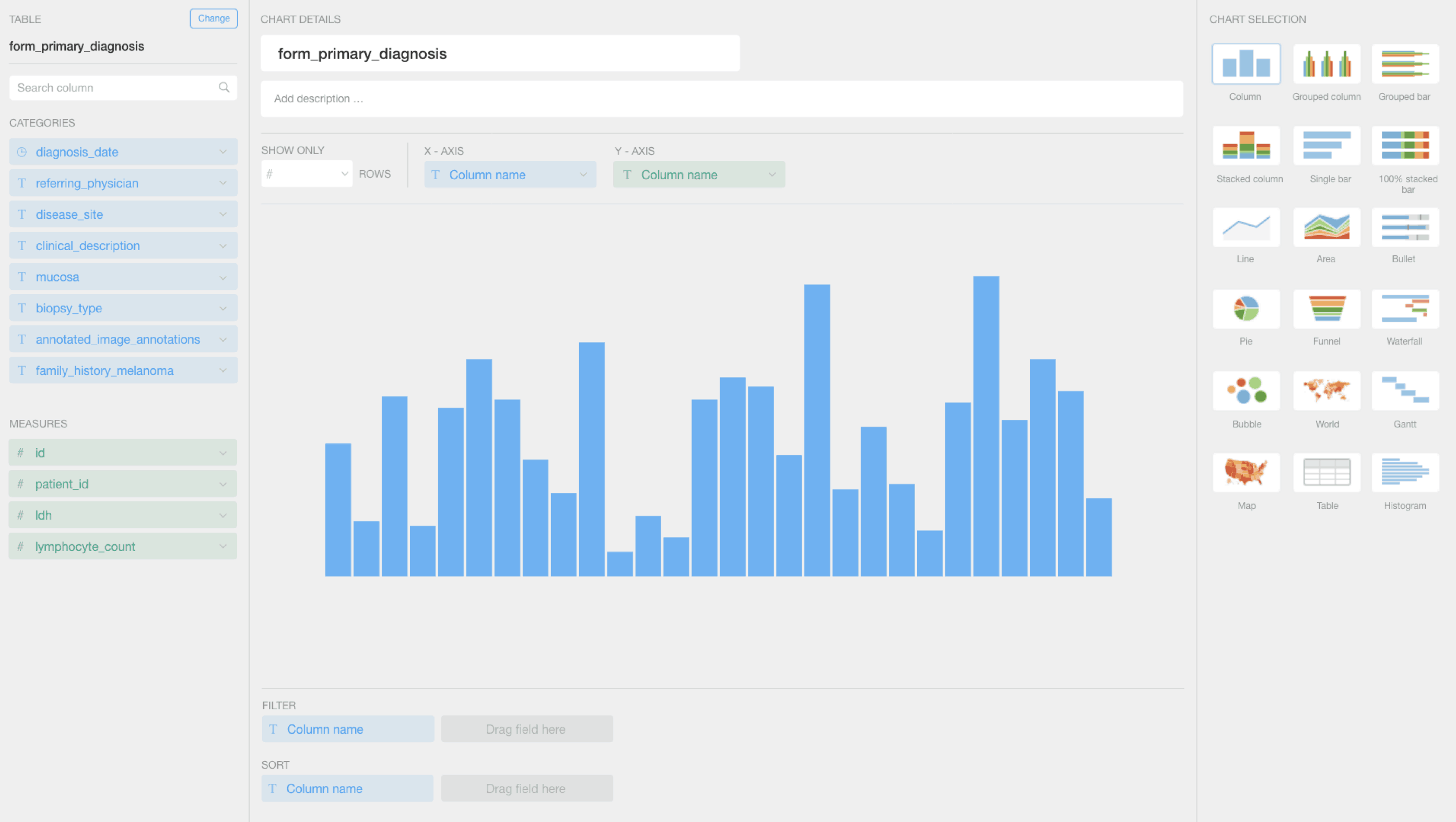
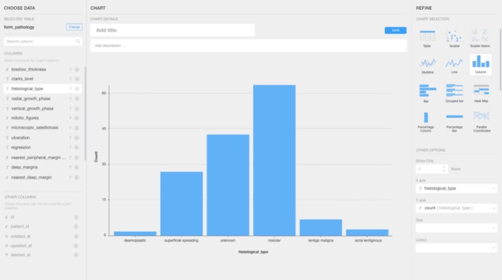
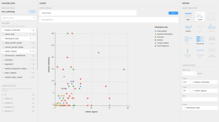
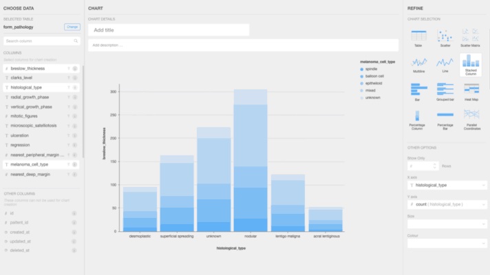
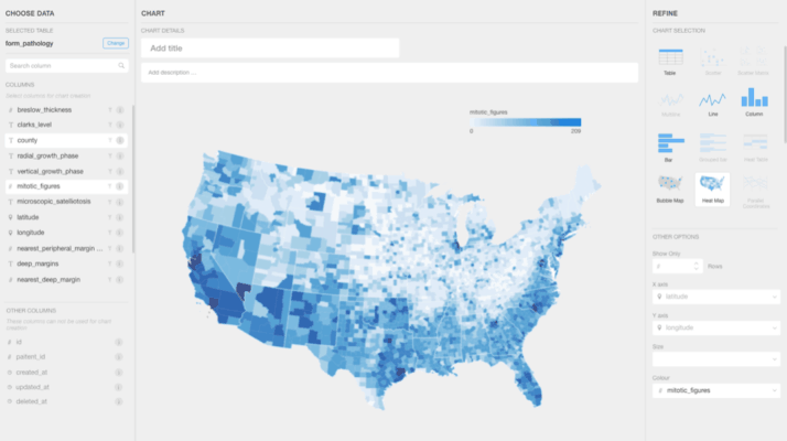
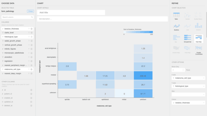
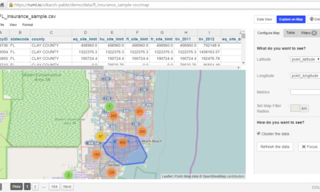
Probe
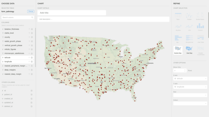
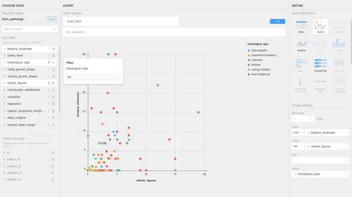
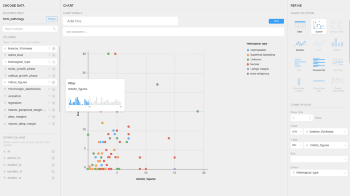
By this stage, we had incorporated most of the charts and maps one could imagine. Our breakthrough was the ability to automatically select the appropriate chart based on the selected data, similar to Tableau.
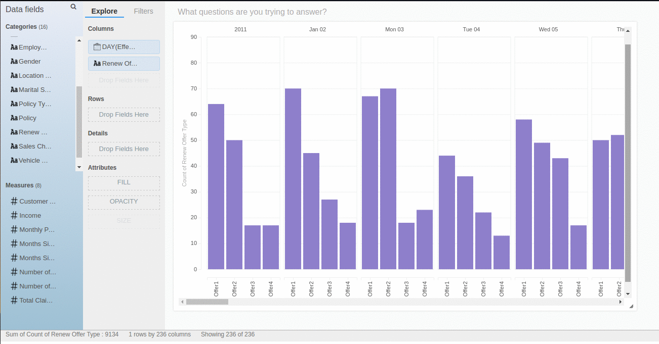
Moreover, all of this is stored in JSONs. Consequently, we began recording the user’s journey of discovery towards insight. This lays the groundwork for future machine learning applications to decrease the time required for insight.
This piece of software was the pinnacle of everything we had achieved in the browser. We built on the foundational grammar of graphics. You can still experience a live demo of its stripped down version at https://pivot-chart.pykih.com/
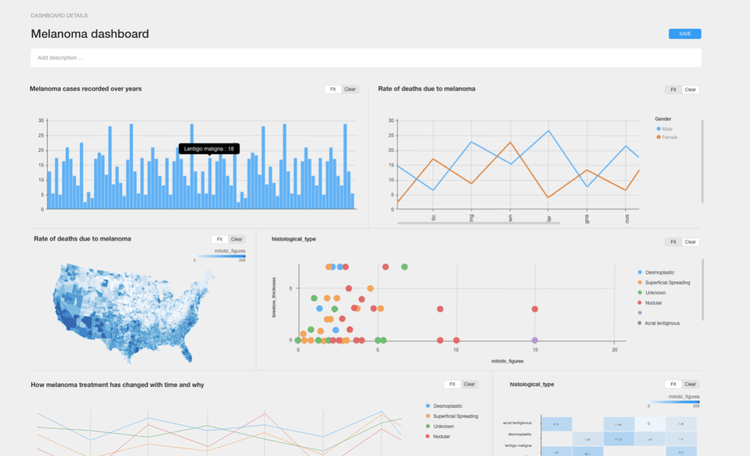
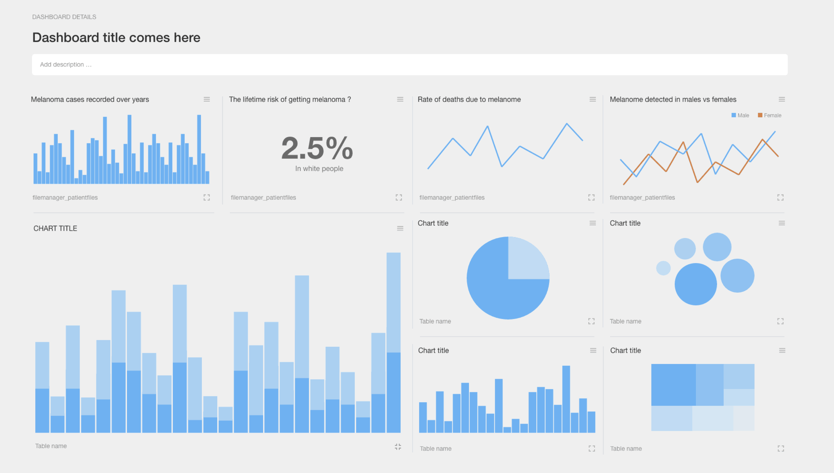
Present
A crucial aspect of decision-making is insight articulation, presentation, and, finally, decision-making. To facilitate this, we planned to build iFrame embeds of charts, data PowerPoint presentations, data stories, and dashboards.
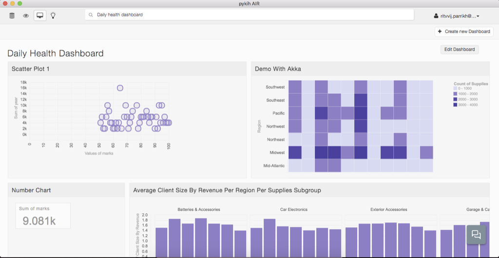
Another skin
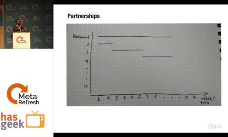
Here’s another skin of AIR that was built. Personally, I am still in awe with some of these designs.