

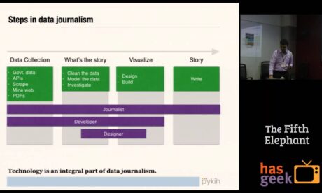
GitHub for Data

Back in 2014, I ran Pykih, an Information Design Studio. We designed and built purpose-built, data-driven interfaces for customers. One common challenge was that these projects often required us to study the customer’s data, sometimes host it, provide an interface for modifications, and occasionally create simple charts. To streamline this process and increase efficiency, we developed an in-house tool akin to GitHub for Data. Over time, this collaborative data tool became the backbone for most of our work.
Business Impact: This tool significantly reduced costs for us. Rather than initiating each project from scratch (FLOOR 0), our GitHub for Data managed 60% of the non-core tasks — including data-entry backends, profiling, cleaning, querying, caching, and hosting. As a result, each new client project commenced at FLOOR 3. This enabled us to either price our services lower than competitors or charge a premium. Moreover, after project completion, clients were often willing to pay a monthly subscription fee to continue hosting their data within the tool.
Technology Stacking: What was cool was that this tool built on all our company intellectual property — our charting library, our SQL in browser framework, and our algorithm to select the charts that are most appropriate to the data.

Failed Attempt At Productizing it: We also attempted to convert it into a product for sale in the then-thriving open-data and data journalism ecosystem in India. However, the business model for this space proved unviable, and selling the product to pure-play enterprises demanded a significantly higher investment than we were prepared to make.
Strategic Value: Eventually, the principles and technology developed here continued to live on in the form of Humane Club — this time integrated within WordPress’s publishing stack.
GitHub for Data
Below is a demo of the product:
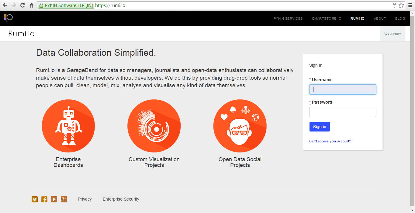
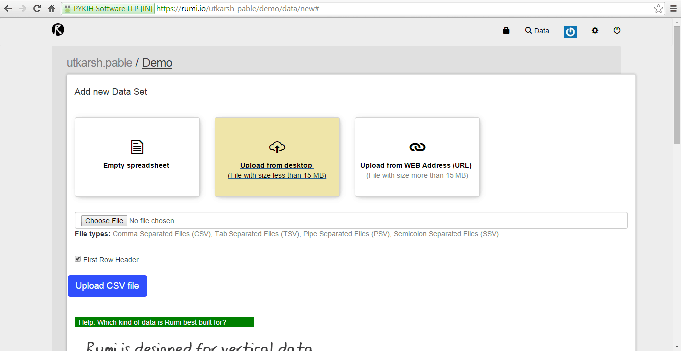
Create a project
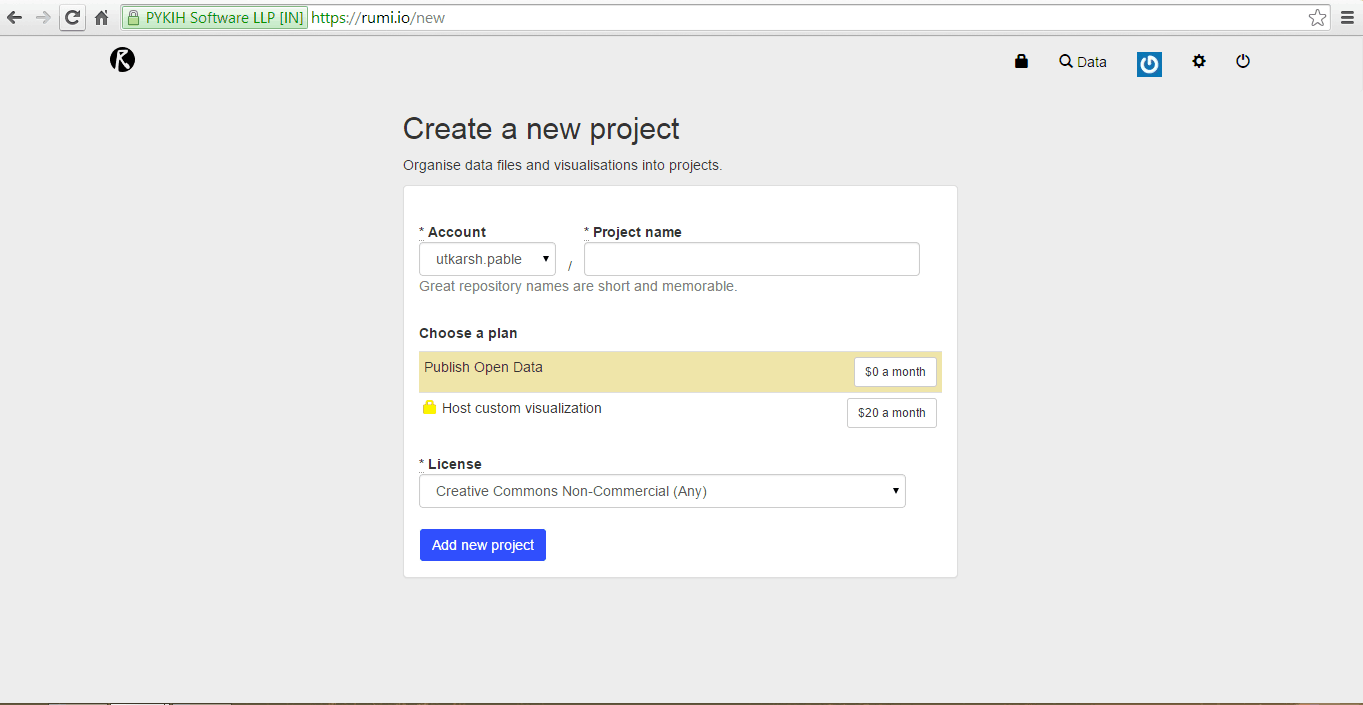
Upload any CSV dataset up to 15 MB. For larger datasets, use a web URL for uploading.
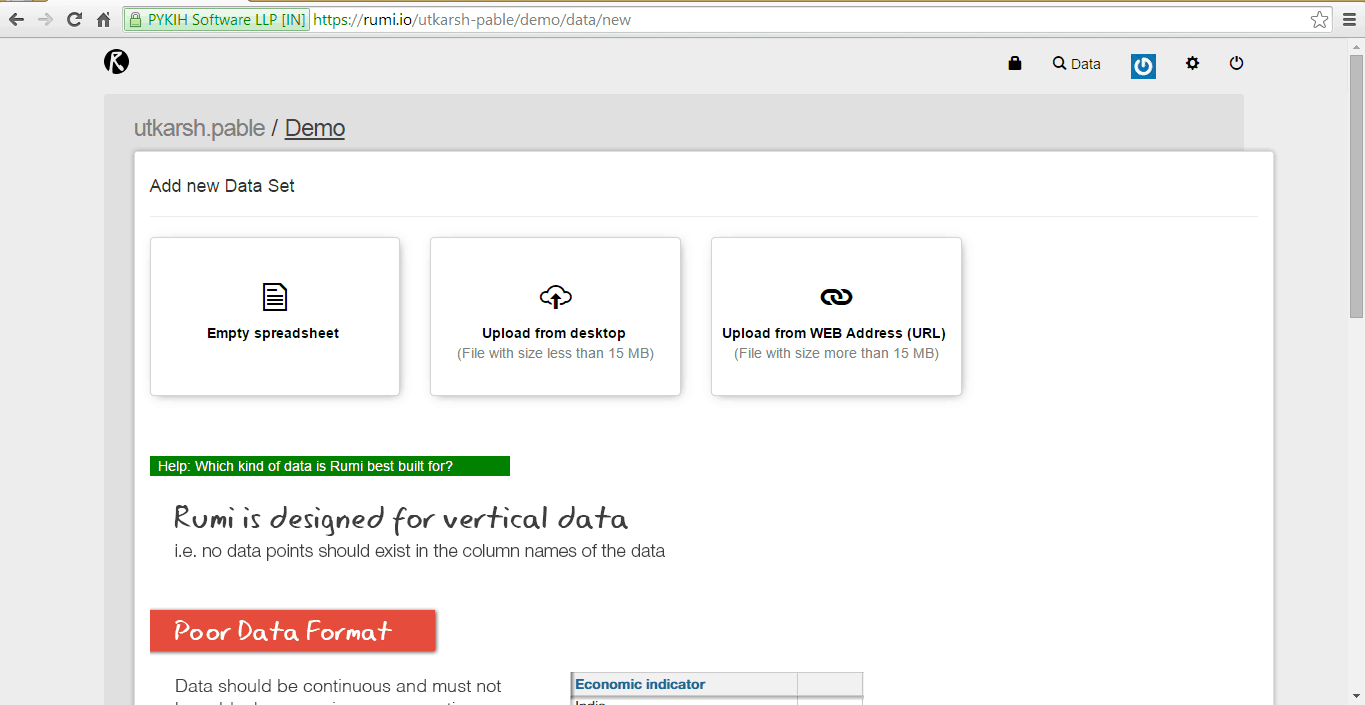
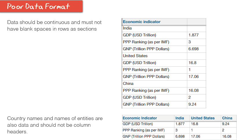
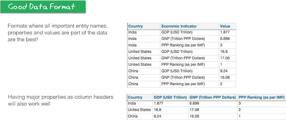
There were clear standards defining good and bad data.
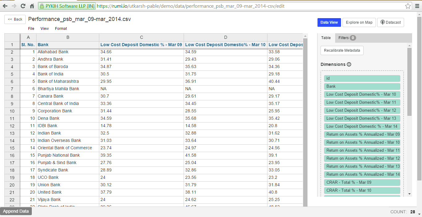
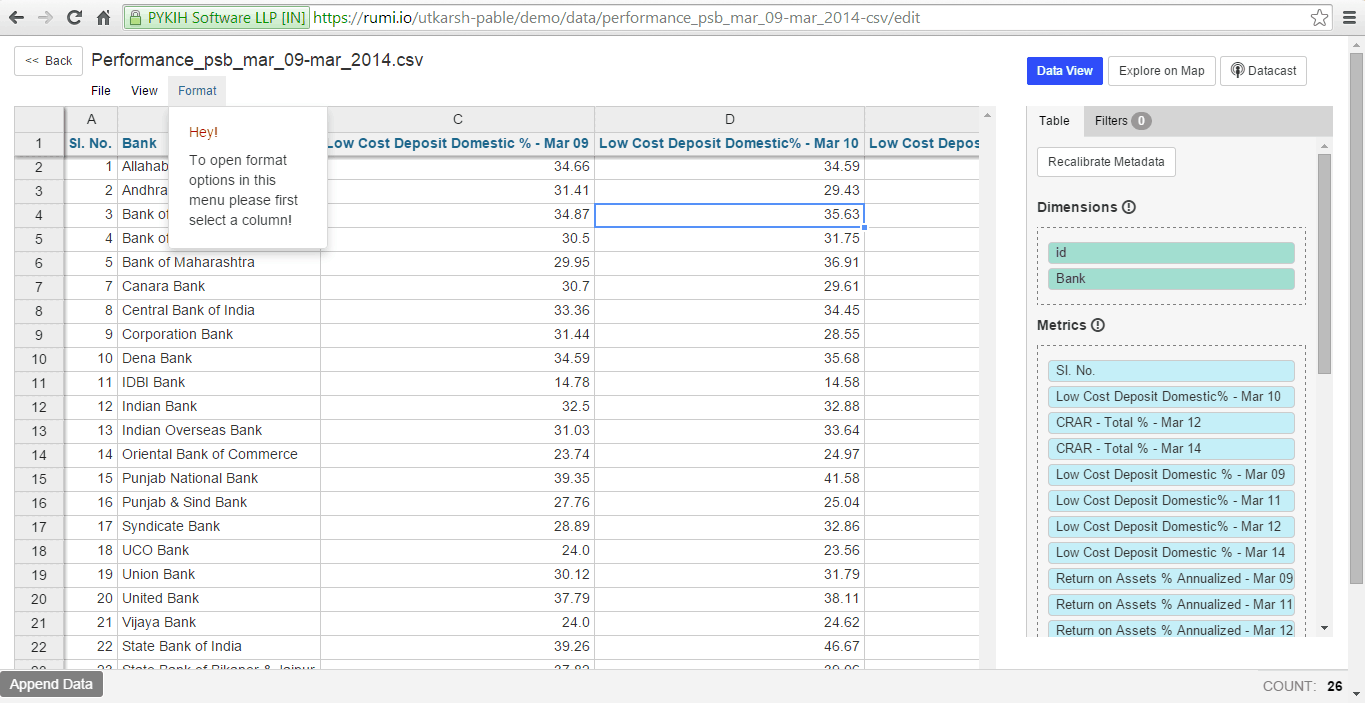
Spreadsheet view
Initially, upon uploading data, it appears in a spreadsheet view. The right sidebar automatically detects columns, categorizing them into two types: dimensions or metrics.
- Dimensions refer to properties or aspects of the data, typically used for classifying and grouping.
- Metrics are parameters that can be measured and quantified.
If our algorithm incorrectly identifies a column as a metric or dimension, you can manually drag the column from one category to the other.
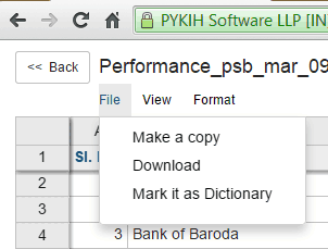
Mark it as Dictionary
You can designate your dataset as a dictionary using the ‘Mark it as dictionary’ option. This facilitates future data cleaning using the same dataset. For example, a dataset containing geographic locations with ISO2 codes can be marked as a dictionary. Subsequently, in another dataset, the ISO2 codes from the dictionary can be referenced for the same geographic locations.
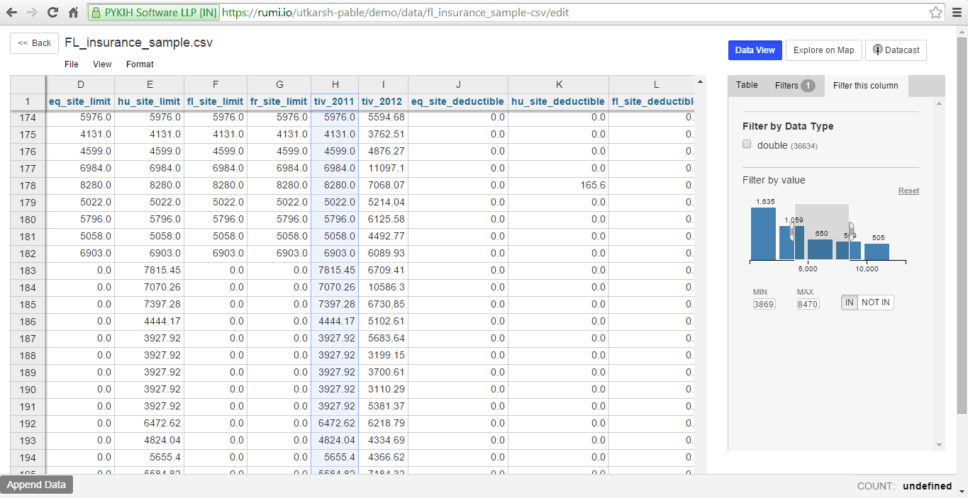
Filters
To filter data, select a column. Numeric and temporal data are displayed as a histogram. Selecting a region on the histogram filters corresponding rows in the spreadsheet.
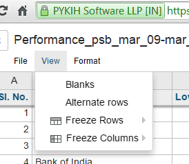
Data Cleaning
Often, collected data is unstandardized and unclean, hindering analysis or visualization. Rumi offers various cleaning functionalities, such as Facets, Distributions, Filter by data types, etc.
To clean a column, select it.
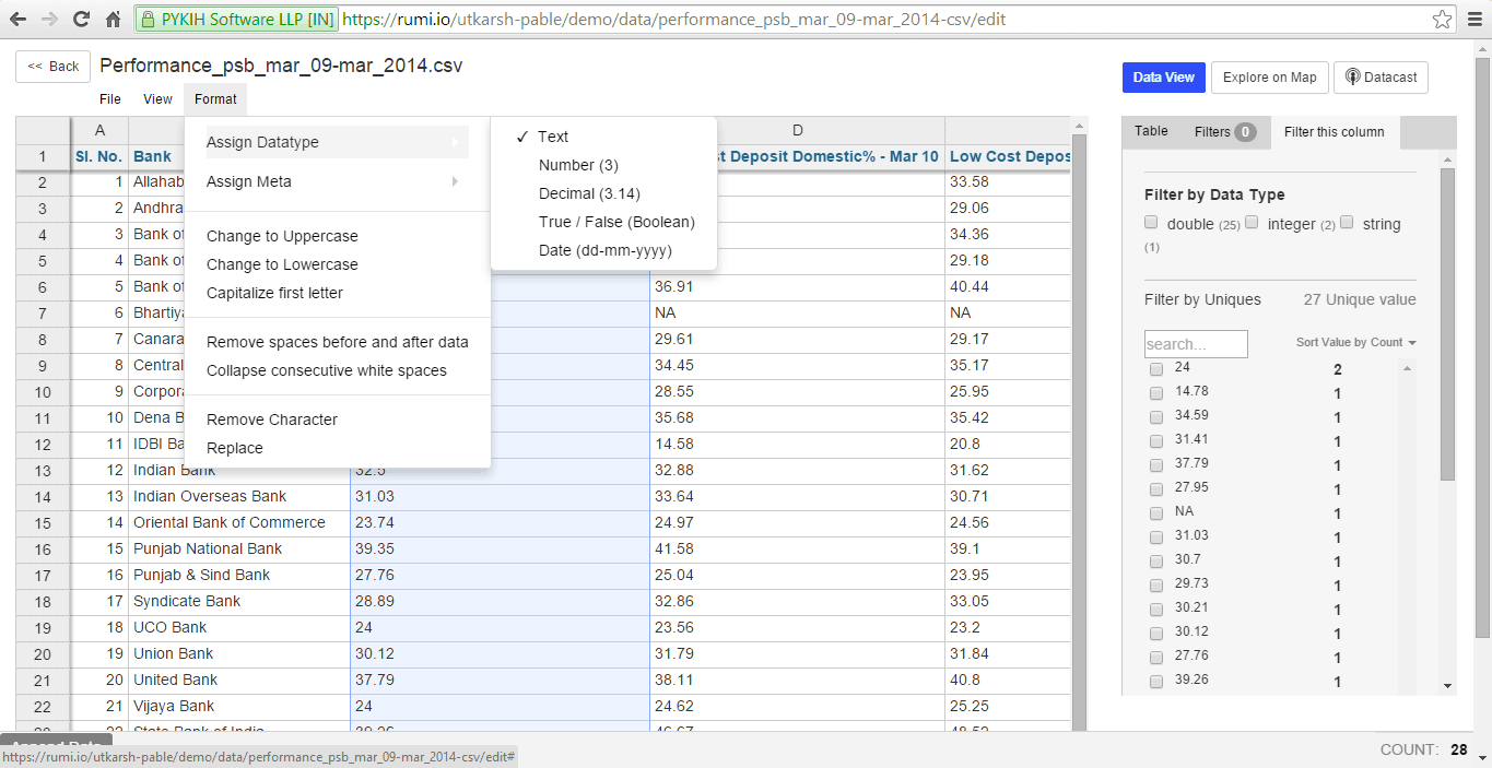
Rumi currently allows assignment of 5 data types: Text, Number, Decimal, Boolean (True/False), and Date. When assigning a Data Type, ensure accuracy, as selecting an incorrect type can lead to data inaccuracies. For example, changing a decimal to a number could reduce precision.
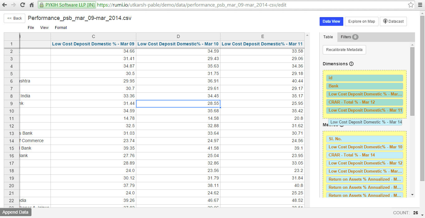
After assigning data types to metrics, you can reclassify metrics as dimensions and vice versa by dragging and dropping the green tiles in the right sidebar into the respective sections.
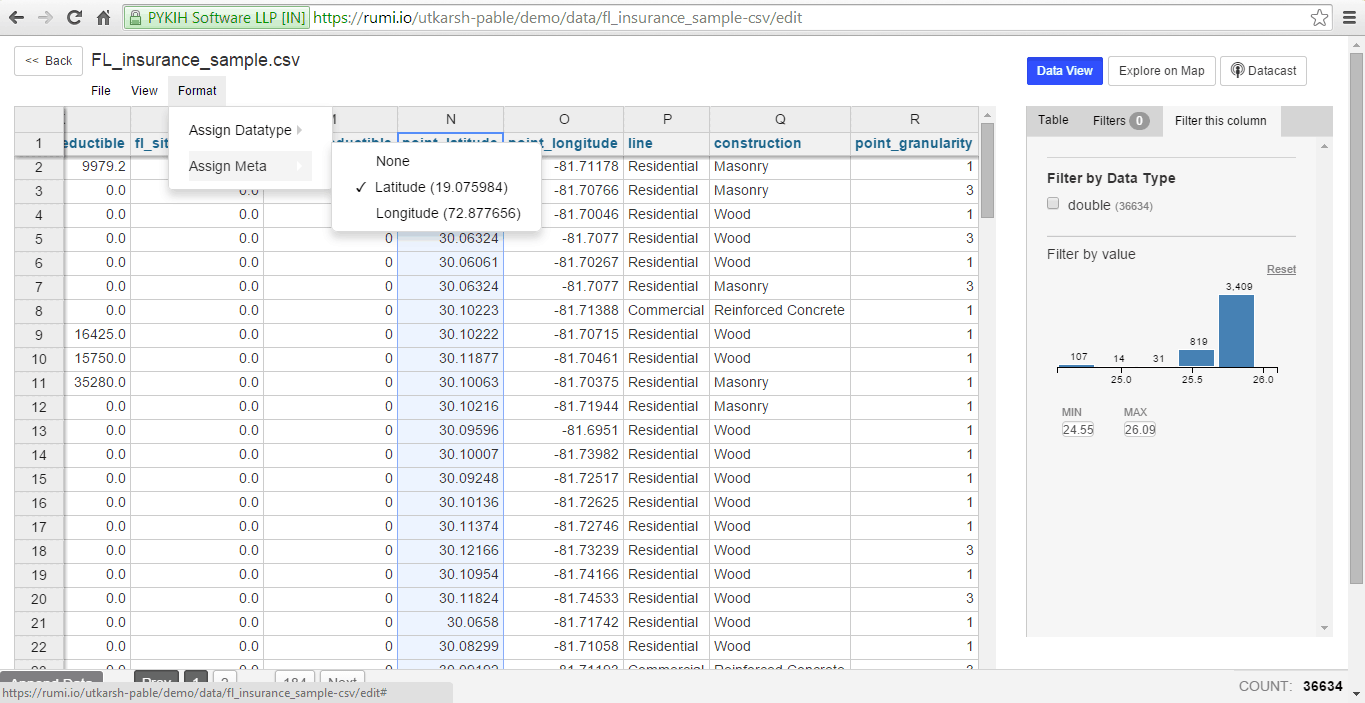
We also offer the option to assign metadata to columns, currently supporting latitude and longitude. This is done through the ‘Assign Meta’ option under ‘Format’.
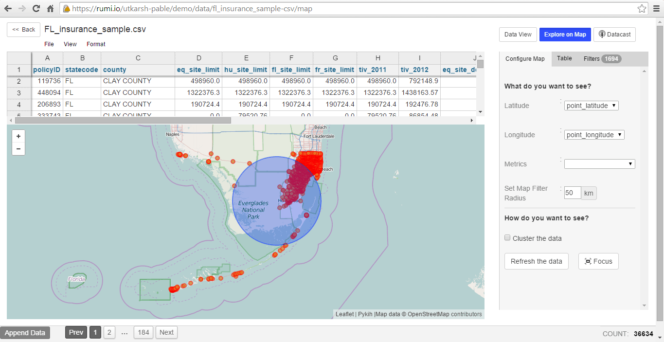
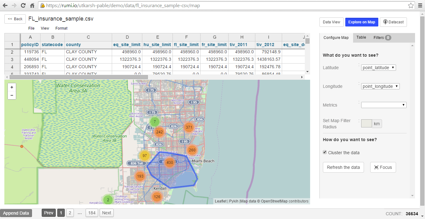
Map View
Along with the spreadsheet, view your data on a map.
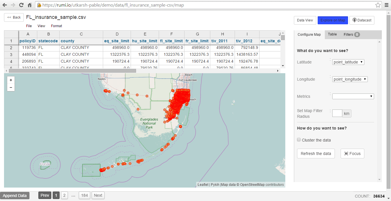
Filter rows in the table by selecting an area on the map, setting a filter radius, and clicking on ‘cluster the data’. This combines points on the map, displaying data clusters.
Charting with Data Cuts
Drag and drop to quickly create visualizations from a selection of over 26 charts and 109 maps with more than 50 features. When you update your dataset, changes automatically propagate to your visualizations. Customize various aspects of your charts, including color, typography, labels, and axes.
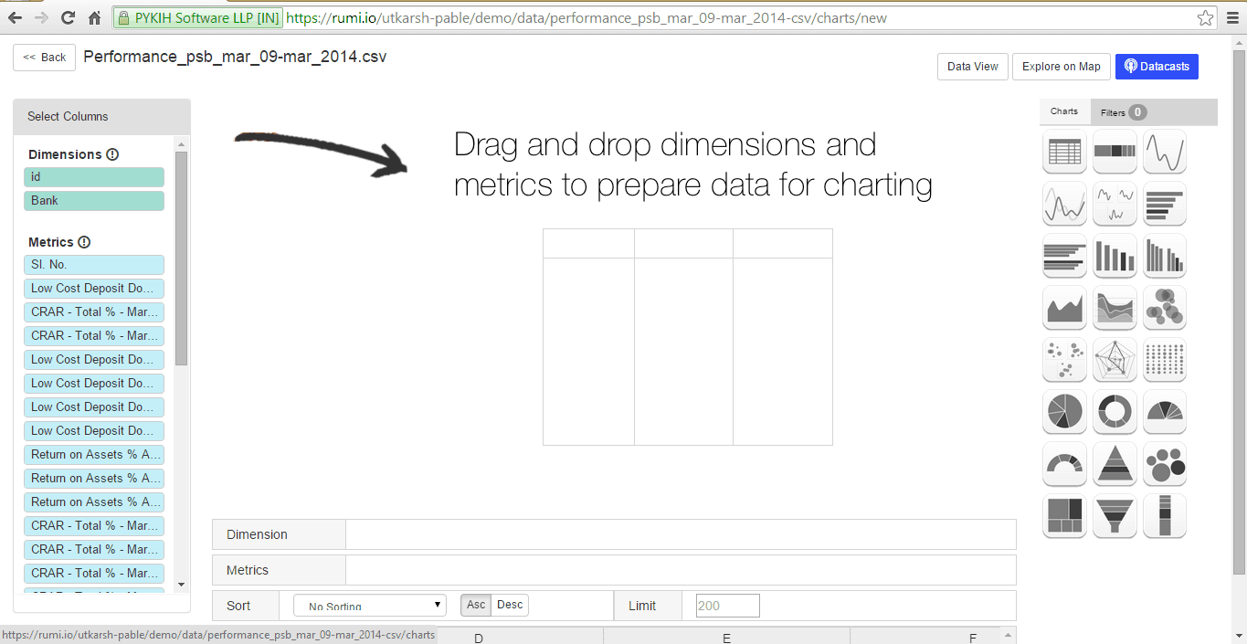
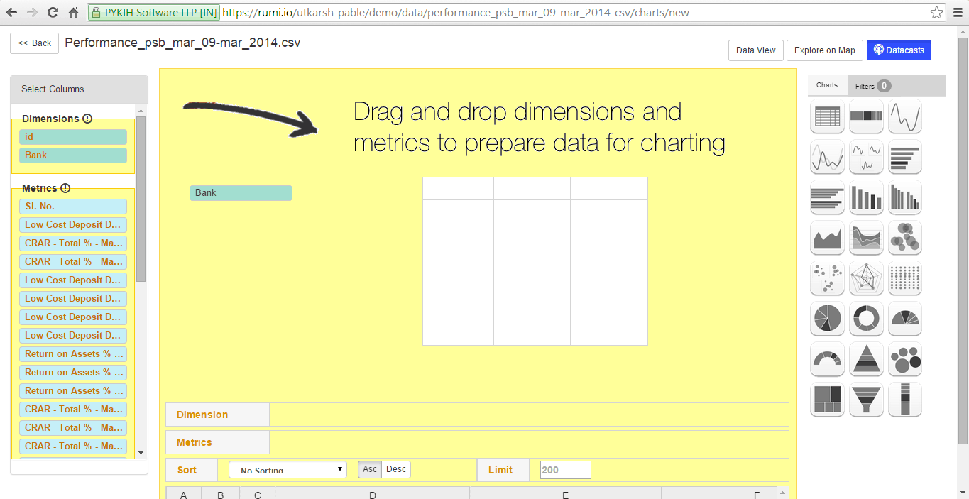
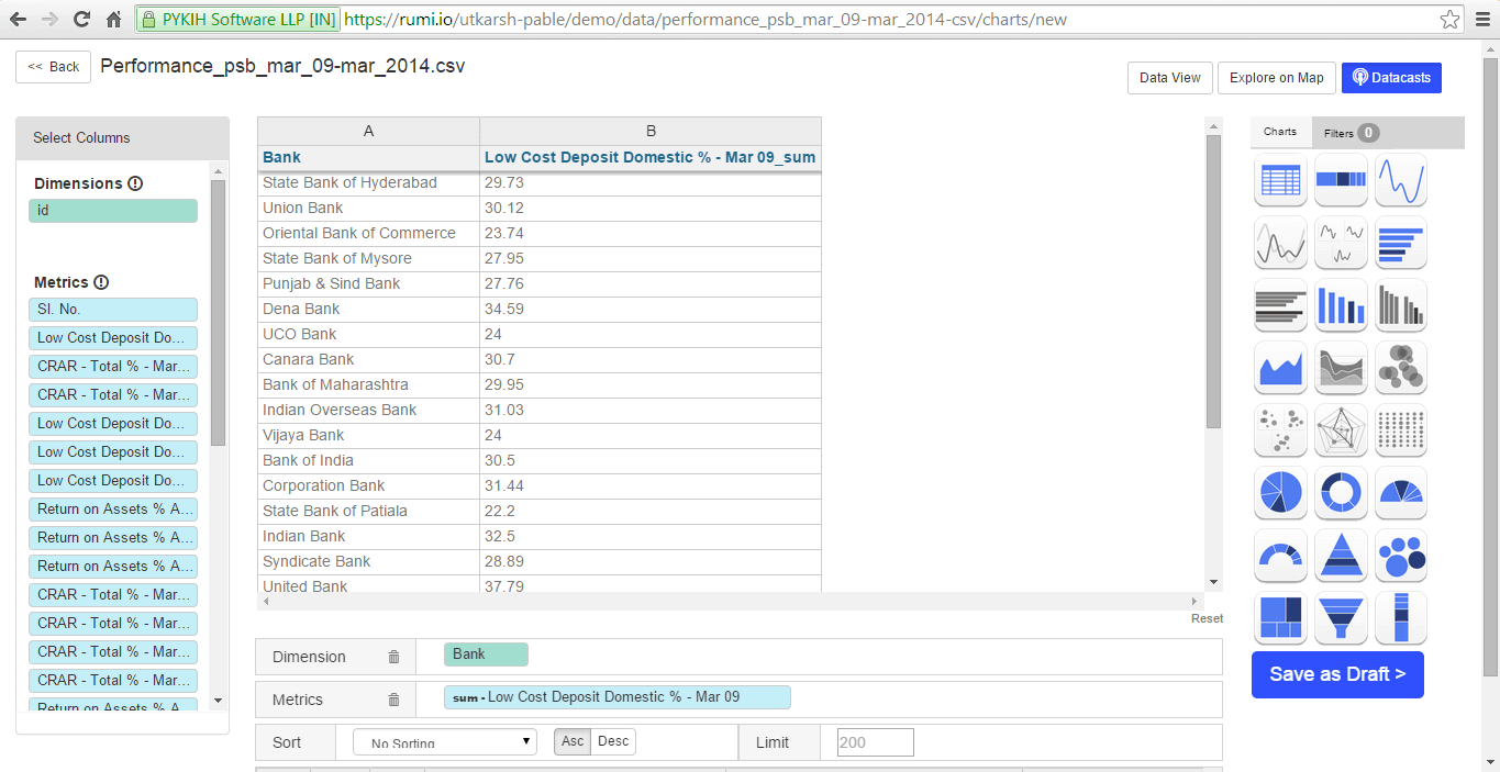
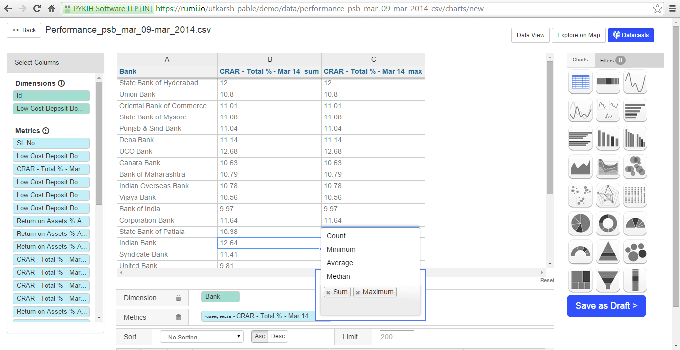
At the bottom, dragged entities are automatically categorized as dimensions or metrics, with the ‘sum’ function applied by default to dimensions. This can be removed by clicking the arrow that appears upon hovering. Rumi offers pre-built functions for metrics, including sum, count, minimum, average, and median.
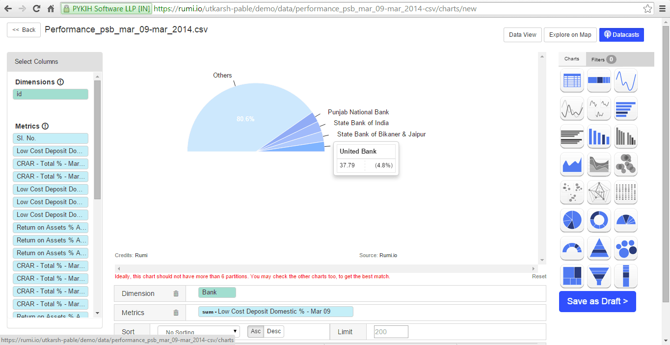
Datacast suggests efficient chart types for your datasets and disables unsuitable options. After selecting an optimal chart, you can save the visualization in your account.
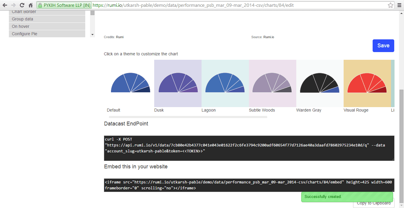
Rumi comes with 11 themes out-of-the-box. Click to apply a theme to your charts, or create custom themes for your organization’s account to ensure your charts align with your branding.
To embed your visualization in a blog, website, or CMS, press the publish button. You’ll receive HTML code for integration. For print publications, like newspapers or magazines, export the visualization in SVG format. This vector format allows printing at any resolution.